BI & Dashboards
Power BI Inventory Intelligence Dashboard & Semantic Model
A Power BI semantic model and dashboard suite that turns inventory, replenishment, procurement, velocity, and deadstock analytics into one connected decision layer.
This project was designed to do more than display KPIs. It organizes multiple inventory questions into a structured reporting system so teams can move from raw operational data to clearer business decisions.
Hero visual upgrade
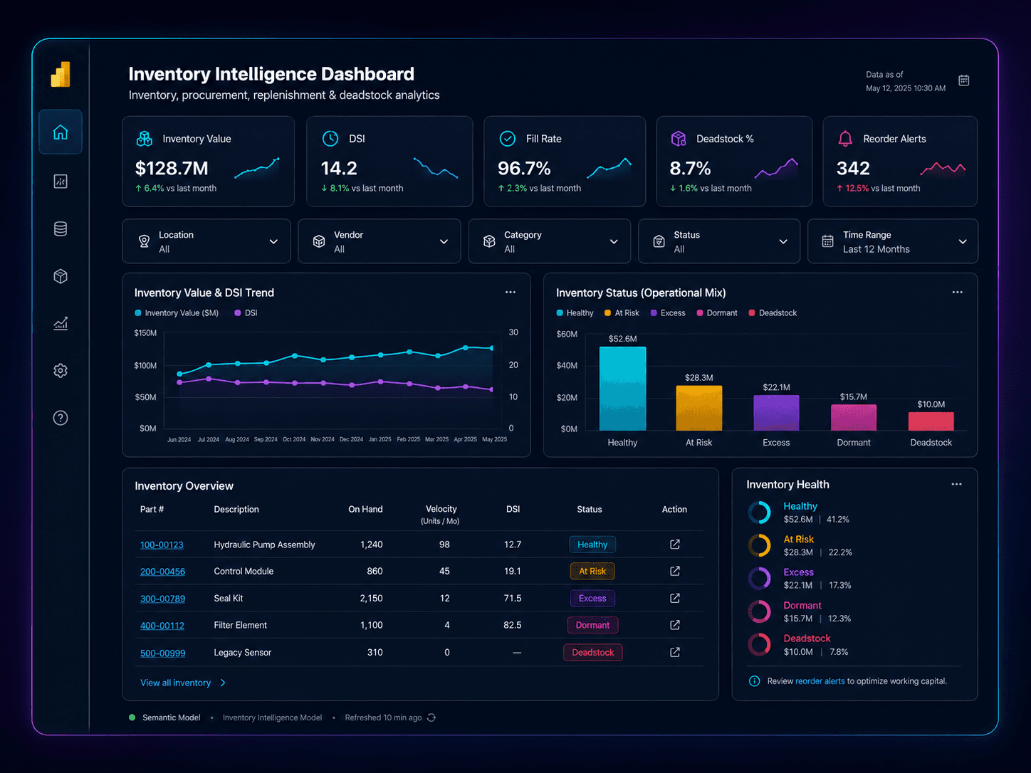
A sanitized Power BI-style mockup showing KPI cards, slicers, trend blocks, status visuals, and an inventory matrix so the case study reads like a real reporting system.
Why the dashboard was needed
Inventory decisions needed a unified reporting layer. Key questions around stock health, movement, procurement, replenishment pressure, and aging were too easy to separate into disconnected spreadsheets, isolated metrics, or one-off report pages.
The real challenge was not simply building visuals. The challenge was creating a semantic model and dashboard experience that connected multiple operational topics into one consistent business language.
What I built
I built a Power BI inventory intelligence suite anchored by a semantic model, custom DAX measures, report relationships, and a multi-page dashboard structure. The system translates operational data into visual workflows for inventory review and decision-making.
Instead of being one dashboard tab, this project functions more like a reporting system: shared model, reusable logic, targeted pages, and clear paths from summary views into detailed analysis.
Reporting flow
How the system tells the story
Collect
Bring together operational inventory data, procurement signals, movement history, pricing context, and supporting source logic into one reporting foundation.
Model
Shape the data into a semantic model with consistent business tables, relationships, and reporting logic so users can work from one shared structure.
Measure
Build DAX measures that convert raw operational activity into decision-ready KPIs, classifications, statuses, and analytic comparisons.
Visualize
Design focused report pages, slicers, tooltips, and drill paths so each inventory question can be answered through a clear visual workflow.
Decide
Turn the dashboard into an operational decision layer for inventory health, replenishment, procurement review, deadstock, dormant parts, and velocity management.
Dashboard suite
Core intelligence views
ABC Inventory Intelligence
Prioritizes parts and inventory classes so teams can focus attention on the items that matter most.
DSI
Shows days-sales-in-inventory style logic to evaluate stocking levels, inventory pressure, and carrying exposure.
Replenishment Intelligence
Surfaces stockout pressure, replenishment needs, and decision signals tied to inventory flow.
Procurement
Supports purchasing review with operational context, inventory position, and action-oriented purchasing signals.
Velocity Intelligence
Highlights movement patterns, part activity, and flow behavior to support prioritization and stocking review.
Dead Stock Intelligence
Identifies aged, stagnant, or overheld inventory so risk can be managed more deliberately.
Dormant Parts
Separates slow-moving dormant items from healthier inventory, helping teams review disposition or strategy.
Dissipation Intelligence
Tracks depletion and inventory drawdown patterns to help interpret how stock is changing over time.
Semantic foundation
What makes the dashboard work
Semantic model
Built around 20 business and data-model tables, creating a structured reporting layer rather than isolated visual pages.
Measure library
The dashboard uses 148 custom DAX measures to convert business logic into reusable KPIs and analytic outputs.
Relationship design
59 relationships connect the model, allowing multiple subject areas to work together in a single reporting experience.
Page system
The suite includes 15 report pages, including tooltip pages, so users can move from summary to detail without leaving the system.
Filtering and UX
Slicers, text filtering, conditional formatting, and focused page layouts improve usability for operational decision-making.
Action-oriented design
The goal was not just to show numbers. It was to create a visual layer that helps teams interpret what needs attention.
Business value
What the dashboard helps teams do
Inventory health monitoring
Gives a consolidated view of stock position, aging, and inventory quality instead of splitting these questions across separate reports.
Replenishment decision support
Supports decision-making around stock pressure, replenishment timing, and inventory availability.
Procurement visibility
Connects purchasing and inventory logic so teams can interpret buy-side decisions with more context.
Velocity and movement analysis
Shows which parts are moving, slowing, or stagnating so action can be prioritized more effectively.
Deadstock and dormant review
Helps identify inventory that may require pricing, liquidation, strategic review, or workflow attention.
Operational storytelling
Turns multiple data domains into one coherent visual system that supports review, discussion, and decision-making.
Impact signals
Evidence of dashboard depth
15-page reporting suite
The project was built as a complete operational dashboard system rather than a single page or a single KPI view.
148 custom DAX measures
The dashboard required substantial business logic, not just basic visuals or out-of-the-box aggregations.
59 model relationships
The semantic model connects multiple subject areas so analysis can happen across a shared reporting foundation.
8 intelligence domains
The reporting suite covers ABC, DSI, replenishment, procurement, velocity, deadstock, dormant parts, and dissipation.
Why this project matters
More than a dashboard — a structured analytics layer.
This project demonstrates semantic modeling, DAX development, Power Query shaping, dashboard architecture, KPI design, and operational storytelling. The value is not only that the report looks polished. The value is that multiple business questions can be answered through one connected reporting system.
It shows how reporting can move from isolated visuals to a more deliberate decision-support layer.
Why the visuals are conceptual
The visuals shown here are sanitized conceptual representations inspired by the Power BI work. They do not expose private company data, credentials, raw exports, internal pricing, customer records, operational screenshots, or proprietary source files.